Sculpture and Ceramics
I chose to take Sculpture and Ceramics class this year because in previous school years, I really liked to sculpt things with clay and paint them after the had been in the kiln and dried. One of my goals for this class is to improve myself as an artist and learn more about art overall. One more goal for this class that I have is to succeed in this class and get an A all four quarters.
First Tile

|

|

|
Second Title High Relief

I chose to base my tile of The Three Musicians because I always have like the painting from seeing it in previous art classes. I also know a lot about Pablo Picasso from my Spanish class and past art classes as well. The elements of art that are best seen are shape, line, space, color, and texture. I chose to create the highest relief on the instruments and parts of the men to create a stronger focal point and point of emphasis.
The original artwork that I based my tile on was The Three Musicians by Pablo Picasso. It was in the form of an oil painting and a collage. It was painted during his cubism period in 1921. The painting is currently in the New York Museum of Modern Art. The painting features 3 musicians and their instruments in a small room. The way the painting is designed, it looks like the men are playing their instruments for a crowd. During Picasso's cubism period, he painted lots of geometric shapes with bright, primary colors. |

I really like how my final project turned out. However, I wish I had more time to paint my project and create all the details. The easiest part of painting the project was mixing the colors since Picasso uses mostly primary colors and blacks and whites. The most difficult part of the project was painting the details of the musician along with the cravings in the tile. I tried several different shades of brown and orange to pain the musicians with to create a balance between warm and cool colors. It was also hard to cover the entire tile with paint and fill the cracks without messing up colors already on the tile. I used different brushes to try to paint the tile we
|
Rattle

|

|

|
I really like how my rattle turned out after it was painted. I wish I could have centered my details a little more but overall I think it was a good project.
|
Greek Pot
|
1. My overall impression of this class has been good. To be honest I didn't think that this class would be so difficult. I consider myself artistically challenged and coming up with creative ways to decorate and create a new pot has been the hardest part. I still really enjoy this class and it is a nice relaxing break to my day.
2. I have participate really well this semester. I also try my best on all my projects and finish them on time. I work hard almost everyday in class as well. 3. I am looking forward to painting and craving new and interesting projects because that is my favorite thing to do in this class. |


Architecture

|

|
|
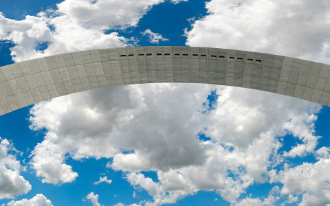
The architect was Eero Saarinen and he designed the St. Louis Arch.
geometric shape, smooth and glossy texture, silver metallic color, negative space under the arch, lines leading up the arch, they're shadow areas underneath the arch and brighter ares on top.
1. Built in 1965
2. Opened in St. Louis because it was the gate way to the west
3. World's tallest arch
I chose this structure because I have been there a few times and the view from around, on top, and under the arch is really cool.

|

|

|
Lewis Ginter was the architect of the middle picture tree house in Richmond Virginia .
geometric shapes, made of wood, smooth texture, brown wood and blueish paint, negative space under the tree house and arches, shadow area under the roof and light areas almost everywhere around the house.
1. The two pictures are an abandoned house in Florida
2. The middle picture is a children's tree house in a botanical garden
3. Both are victorian style treehouses

|

|
My goals for this project is to follow all the guidelines especially the texture and design and have great craftsmanships. I also want to make a project I actually like and proud of.
Assemblage

I really like how the outside of my box turned out. I think it creates a lot of contrast to the inside and leads to the eye to the inside of the project. I think the least successful part would be the edges of the paint. Painting in the corners was tricky and it was hard to remove different color paint from each other. I could have painted first before putting the objects and collage.
I really liked doing this project and learned that I'm a hardworker
I wanted to incorporate lots of different textures and looks into my project like the ripped cardboard and the glossy magazine paper as the background. I need to find some more objects and 3D things into it. I need to cleanup the paint and the edges. I really like working on this project.
|

the collage, the outside cardboard, and the patterns of colors. I placed the texture on the outisde to create contrast and used the color red to tie in the queen and the hearts on the inside. I also used the blue paint to create a dream like sky.
I used a new texture of cardboard and used rubber cement. I had to have great craftmanship in order to keep the collage, the paint, and carboard of touching each other. I used extrea steps like the painted tape to have cleaner edges.
|
Plaster People

|

|
|
The goals of the project would be to create a life-like mini human sculpture with muscles and correct proportions. Also to chose color carefully based on psychology. I wanted my project to look somewhat life like and have a really cool pattern with colors.
|
This was one of my favorite projects this year. I really liked working with plaster, wood, and paint. It was difficult to mold and form the person to make it seem more life-like. My favorite part was choosing the colors and patterns and then painting them on to the sculpture
|
Compression Pot
I really like how my compression pot turned out. I took a lot of time to crave the waves into it to make sure they were deep enough to stand out. I chose to glaze the outside a light blue with another layer of semi-transparent glaze that added even more colors to it. I glazed the inside a solid black to contrast the outside colors.
Final Written Reflection
Throughout this school year, I have participated in the Sculpture and Ceramics 1 class. Besides in middle school, this is my first art class involving plaster, glaze, paint, and clay. My most favorite projects are both the first and second relief titles and then the final compression pot. My most successful project this year was my second relief tile. This is probably the best project I've made all year based on form of the instruments and musicians and the high relief. I used a pin tool to create the definition and the lines and shapes on the tile. I also used warm colors to project the Three Musicians painting by Pablo Picasso. My least successful piece was probably Architectonic project. Before I glazed my project, I really like how it looked. After I glazed it and it was fired, the colors were not how I thought they would be, and the glaze brought out craftsmanship errors I had made. However, the next project I used glaze on, I made sure to be very very careful :-) I benefited from this class during my everyday life my improving my art skills and the patience that go along with making projects and having good craftsmanship. I also enjoyed the break I got each day from school subjects to make art!
